
How we made personas to help us empathise with customers
Personas are a tool to help product teams make customer-centred decisions. We wanted ours to be useful, relevant and unbiased – and in the process of creating them we learned a few lessons and broke a few ‘rules’. Here’s how we went about it.
A tool for making better decisions
Personas are fictional people representing different types of customers. They often have a photo, a name, a bio, maybe some things that frustrate them or motivate them to use the service. Mailchimp made some memorable personas a few years ago. At their best, they’re based on research and help product teams stay focused and make customer-centred decisions, or help acquisition teams segment the market.
At their worst, they’re over-simplified, irrelevant and introduce bias. They can end up languishing in a dusty cupboard, used for a week or two and never seen again.
At Farewill, we’d accumulated 2 years of in-depth research, mostly one-to-one interviews. It’s a goldmine of experiences and insights, but it was hard to see the big picture without reading every transcript. So we wanted to step back and challenged ourselves to boil it all down into personas that would:
Capture the essence and meaning from our research
Convey the rich experiences and emotions of the participants
Be genuinely useful and usable for product teams
Help us make better decisions about our products
Help anyone at Farewill (not just product teams) empathise with our customers and our mission
Cover broader user journeys beyond Farewill’s products, so we can help customers achieve their goals
Not introduce bias
Our lead user researcher, Clare Ridd, and I led the project. It took 2-3 months, alongside our other work.
Analysing hours of primary research can be emotional
We had the research – now we needed some way of collating and analysing it.
Clare suggested framing insights in terms of life events, like accompanying someone through a terminal diagnosis or arranging a funeral following a bereavement. It’s a framework that spans beyond our products and covers a rich spectrum of experiences (most of our research participants were not Farewill customers, and we wanted to capture the fullness of their journeys).

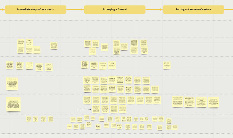
Using Miro (a virtual whiteboard), we laid our life events horizontally. On the vertical axis were our research projects and participants – one row per participant.
We then recruited a dozen volunteers around Farewill to read the original research transcripts, draw out insights and place them on the board. We asked volunteers to:
Pick and read a transcript, and take their time to deal with any feelings that came up – many were verbatim accounts of grief and loss, which can be hard to read. I found it emotional, but also very rewarding and inspiring.
Go back over the transcript and draw out things that happened to the participant, choices they made and how they felt about it. We wanted to convey the richness of the experiences and emotions.
Create a virtual sticky note for each insight, making sure it would make sense in isolation, as we knew we’d move them around the board at a later stage.
Place the insight on the board.

Here’s a section of our Miro board from the end of this stage...
When we started grouping insights, themes began to emerge
Over a few weeks we’d studied and analysed around 20 hours of in-depth interviews from 27 research participants across 7 projects. But we were a long way from something usable.
We saw a few themes emerging, and we began by grouping stickies into ‘opposites’. Things like a supportive family network vs difficulties in family network, and expected death vs not expected death.
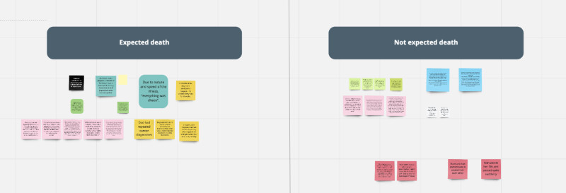
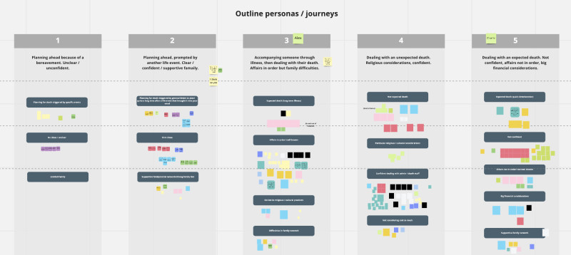
We took these opposites and mixed-and-matched them into 5 outline personas. This was a painstaking, unscientific task – shuffling things around, beginning to form coherent narratives. Each outline persona could have insights from 10-20 research participants!
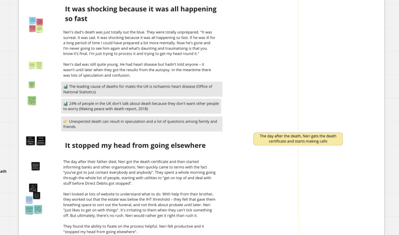
From those buckets of insights, our personas began to emerge. We started writing out insights in a narrative, with the source sticky note next to each paragraph. We also began to include data and statistics, to support and draw out insights.
A format that conveys the richness of people’s experiences
It was time to think about a format. We got the rest of the Farewill design team involved. Should we go with a conventional persona format, laid out in A4 landscape? (A bit reductive perhaps.) Something that fits on a poster, to hang in the office? (Not very remote-friendly.)
We looked back at our goals, particularly:
Convey rich experiences and emotions of the participants
Be genuinely useful and usable for product teams
Help anyone at Farewill (not just product teams) empathise with our customers and our mission
Planning for and dealing with death are complex, emotional subjects. We realised if we summarised too much we couldn’t convey the richness of people’s journeys, and we wouldn’t be able to empathise with them.
So we broke with convention and made each persona a narrative, laid out on a webpage. We included real, unedited quotes from participants. Next to each quote is a sticky note, so can track every single insight back to a primary source. Along the way are call-outs which highlight key points and data for extra context.
We wanted readers to have an emotional reaction, and be moved and inspired by the participants’ stories.
Avoiding bias – gender-neutral, and no photo!

We broke the ‘rules’ in other ways too.
Conventionally, personas have a photo, gender, age, bio and home town. But those things can trigger our subconscious biases, which can mean ending up with products that aren’t designed inclusively. A photo of a suit-wearing middle aged white man from Oxford might make us approach things a certain way, whether we’re conscious of it or not. Here’s a great Medium post about bias in personas.
We wanted to help our product teams design inclusively so we stripped out certain things that we felt might trigger bias, while retaining a distinct personality for each persona.
As a result, our personas:
Are gender neutral, with names like Reese, Zia and Neri
Have unique and beautiful illustrations that represent aspects of the story – thank you Louis for drawing them! – rather than photos
Don’t have a bio or home town
Most of our personas do have an age because it can be relevant to the story. For example, an older person is more likely to have attended a funeral or dealt with the loss of a loved one.
A warning – reading our personas can be tough
Our personas are the genuine experiences of real people. The quotes are words real people have said. Reading them can be upsetting, so our personas come with a trigger warning and signposting for support.

At Farewill, we take a great deal of care to support colleagues dealing with these difficult topics. For example:
We have a group of mental health first aiders
Our Farewellbeing support service gives staff access to free therapy from mental health professionals
We have supportive managers
Reading or hearing about someone’s experiences with grief can be tough, but it can also be an immensely touching and worthwhile experience that helps us design with empathy.
Helping our personas ‘stick’
Our personas have to be useful, and they have to be read. To help them stick, we wanted to over-communicate.
For a few weeks we had a slot in All Hands (the weekly meeting where the whole company gets together). Each week, one person at Farewill would talk about the impact and insights they got from reading a persona – these were people from different teams (commercial or operations for example), so we could hear different perspectives.
We also spoke to the whole company about how and why we made them. We made sure they’re easy to find and use from our internal documentation (we use something called Notion). We have a #personas Slack channel for questions, and we’ll be following up in the coming weeks with a survey to find out how useful they’ve been and how they’ve helped teams make decisions.
Already, they’ve been super useful in our weekly design crits – we often refer to our personas to help set the scene for our design choices.
We’ll keep coming back to them. Personas should be living documents, updated (with care!) when we learn more.
An emotional, rewarding project
I absolutely loved this project. Working with Clare was a joy. We had quite different approaches and often disagreed, and the end result was so much better for it. It was fun, emotional, incredibly time-consuming and hard work.
Ultimately, it all stems from the superb research conducted by Clare and her team over the last couple of years. We’re so lucky at Farewill that we have so much investment and importance attached to design research.
Among other things, this project has taught us:
Every shred of a persona should be evidence-based, and it’s worth putting in the extra mile to achieve it
It’s good to break persona conventions if it makes them more usable and relevant
It’s important to minimise bias and maximise inclusivity
Our approach to making personas was quite Farewill specific – the story format, the rich and emotional experiences, and so on. What worked for us might not work for others.
Whether you’re contemplating personas or just intrigued about the workings of the Farewill design and research team, thank you for reading!
Read our personas
We made our personas public. If you like, you can read the current version.
Read our personas

Come and join our trailblazing product team!
Our product and design teams are a diverse, supportive and inclusive bunch working on a rewarding, challenging mission – to change the way the world deals with death. And, as you’ve read, we love research! Fancy joining us?
See our open roles